Web UX/UI
In 2023, the University of Birmingham embarked on a broad digital transformation programme, providing opportunities to improve the user experience for key journeys, to meet user needs and better reflect the University’s offering.
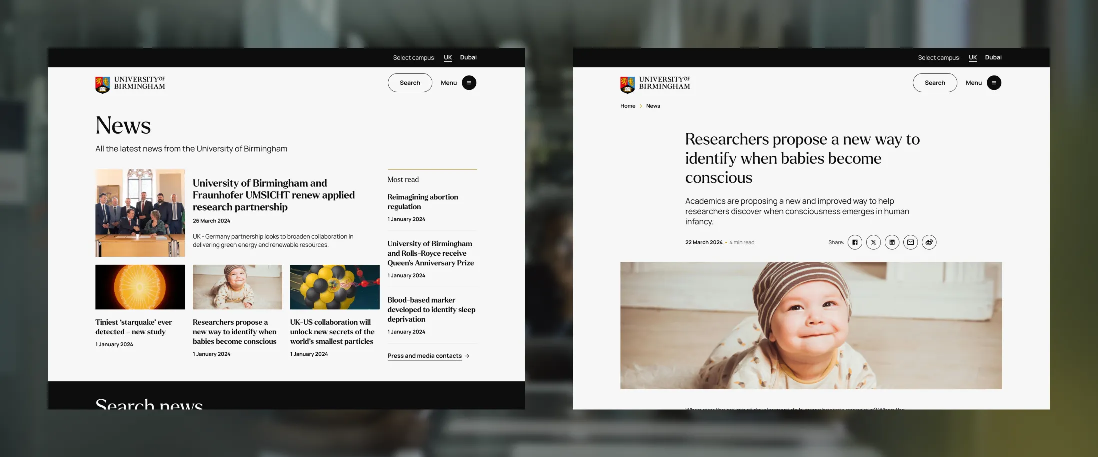
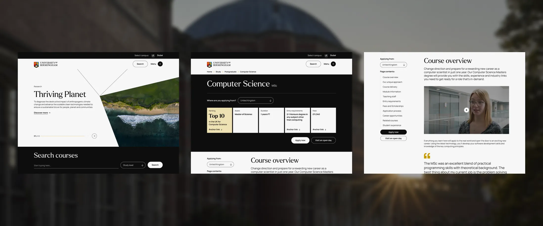
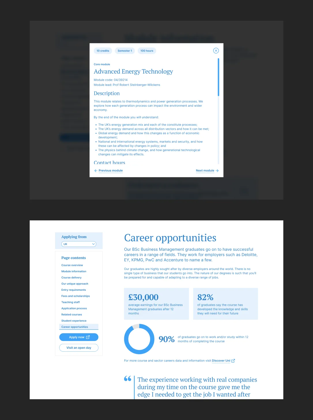
One of the main areas identified was course pages – a critical point in the student recruitment journey and essential for prospective students to understand and assess the courses they are applying for.
On top of this, the University had recently undergone a radical rebrand, and needed help bringing this to life across their website and other digital products.
My role was to work with the client and their partners to redesign the website in line with their new visual identity, whilst re-evaluating and improving the design of course pages informed by user needs and behaviours.
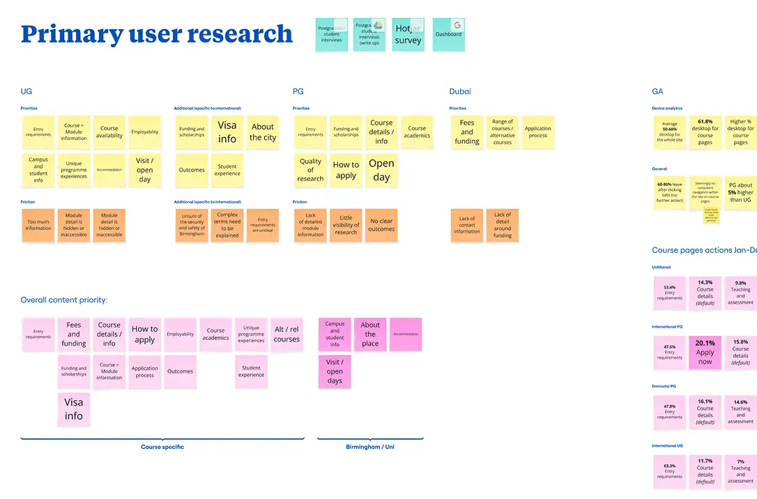
After analysing and summarising the research that had already been conducted into course pages, I worked with a digital strategist to carry out further market research, analysing content structure and copy, web analytics and user journeys. Clear insights and trends from this research helped to form a set of hypotheses to visualise and test.
Applying for a University course can be quite overwhelming, given the vast amount of information prospective students need to process. A user-centred approach allowed us to meet students where they are, prioritising content and signposting effectively, personalising and flexing to different study levels, course types and countries, all whilst highlighting the University of Birmingham’s unique offer. This formed the basis for a prototype which was tested with a mixture of undergraduate, postgraduate, domestic and international students in one-to-one online moderated sessions.
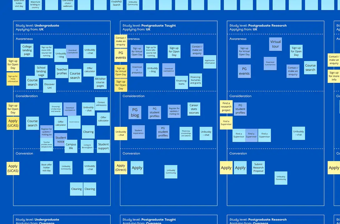
Alongside this, I worked with stakeholders across the University to conduct a website component audit to better understand the features of their current site, how they were being used and how we might improve, remove and consolidate before redesigning them.
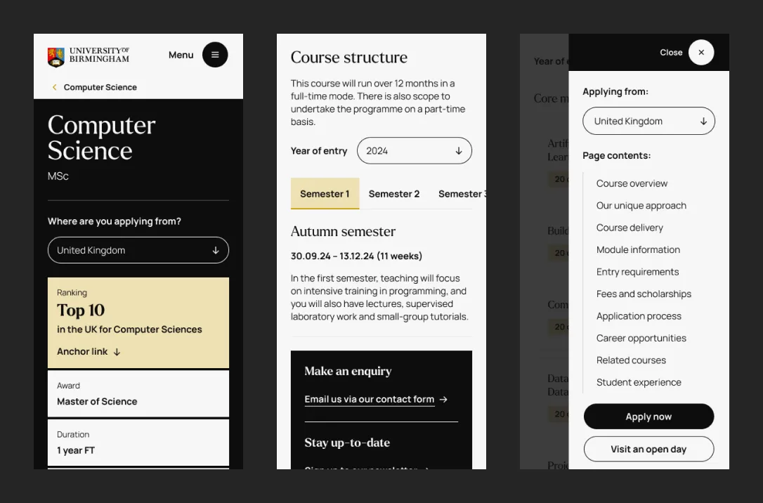
The results of course page testing were positive with an overall satisfaction rating of 75% and lots of useful insights. Users found the new designs a lot easier to navigate, but still had some issues with content and labelling, which were addressed through an iterative design process.
A refined prototype and content strategy helped editors design pages in line with users’ expectations. New course pages were then designed along with the rest of the website, incorporating the University’s new visual language, and defining a flexible pattern library adopted across the digital estate.